Is it that time of the year already?
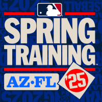
This week, Major League Baseball released its new official logos for its 2025 Spring Training schedule. This year’s logos for the annual six-week slate of exhibition games include an all-new primary mark, a slightly modified alternate design, and designs for both the Cactus and Grapefruit Leagues, respectively. Each club also gets a logo featuring their team name and the location of their Spring Training camp.

The primary logo for the 2025 Spring Training breaks out of the template used for the last three Springs (hooray). This year’s design features “SPRING TRAINING” in the centre in a large, bright blue typeface. These words are framed by two horizontal red lines above and below. Above the text is the familiar MLB Batterman logo; below, we see the abbreviations “AZ” and “FL” enclosed within a blue rounded rectangle, representing the two host states of Arizona and Florida. In the lower right corner, the year ’25 is set inside a beige circle, which is itself encased in a red diamond.
The alternate logo for the 2025 Spring Training offers the most minor of variations imaginable on the primary design. This version maintains every single one of the elements from the primary, however, this design is set against a beige rounded rectangle.

For the teams setting up camp in Arizona, we’ve got ourselves a special Cactus League logo. This design features a bold red and dark navy blue colour scheme with “CACTUS LEAGUE” front and centre. A red diamond with the abbreviation “AZ” set within a beige circle is placed at the centre of the design. The MLB Batterman logo is positioned at the top, with a red horizontal line above and below the “CACTUS LEAGUE” text. A secondary mark makes the state name the star across a beige, rounded rectangle.

Like their friends out west, the Florida-based clubs get a similar Grapefruit League logo. The 2025 Grapefruit League logo features a crisp, double-blue colour palette with “GRAPEFRUIT LEAGUE” in the middle and a blue diamond containing the abbreviation “FL” at the centre. Like all other 2025 Spring Training logos, the MLB Batterman logo sits at the top, with two blue horizontal lines framing the text.
Each club will get a version of the 2025 Spring Training logos for use in their promotional materials, schedule graphics, merchandise, and so on. Cactus and Grapefruit League stationed teams will have the same design, with the logo’s colour being the only difference (Cactus League teams in red, Grapefruit in light blue). The designs prominently feature the team abbreviation for each club, such as “ATL” for Atlanta or “STL” for St. Louis. A diamond with the club’s cap logo is placed upon this abbreviation. The team’s Spring Training camp is located below. These logos are placed upon the same beige, rounded rectangle we saw on the Spring Training alternate logo.

Catching my eye is that the Athletics are really going forward with that silly plan to use only the name”Athletics” with no location attached for next season; their 2025 Spring Training logo will use the abbreviation “ATH.”
Looking back on some historic Spring Training logos, we see the league started to settle in on a template in 2022, modified slightly in 2023 and 2024 before being scrapped in 2025.
Is this a return to the days of a new Spring logo every year or the start of a new template? We’ll find out a year from now. We already know that MLB is considering setting up templated elements in their All-Star Game logos. Nevertheless, if an event logo HAS to be templated in Major League Baseball, this is one of the few that I would be willing to sacrifice to the gods of consistency.


