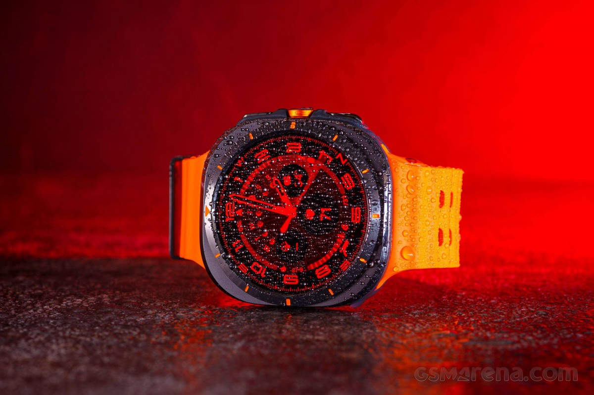
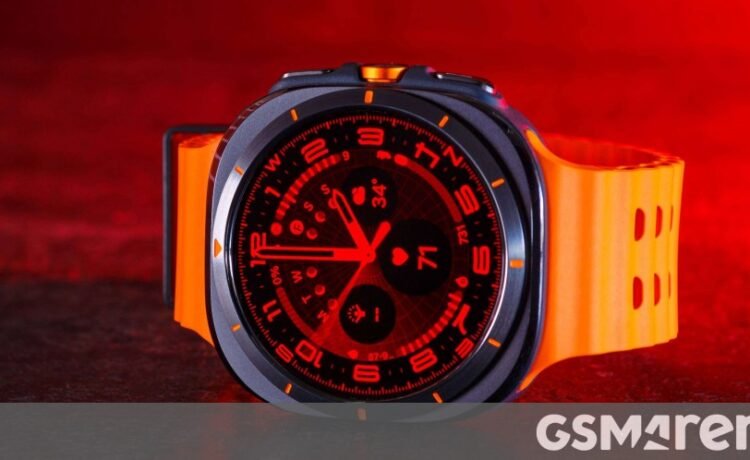
The Samsung Galaxy Watch Ultra arrived in the office in no less than three separate boxes! The watch has its own box, the “S/M/L” band has its own box, and they’re in a bigger box. You get a USB-C to wireless charging puck with the watch as well.
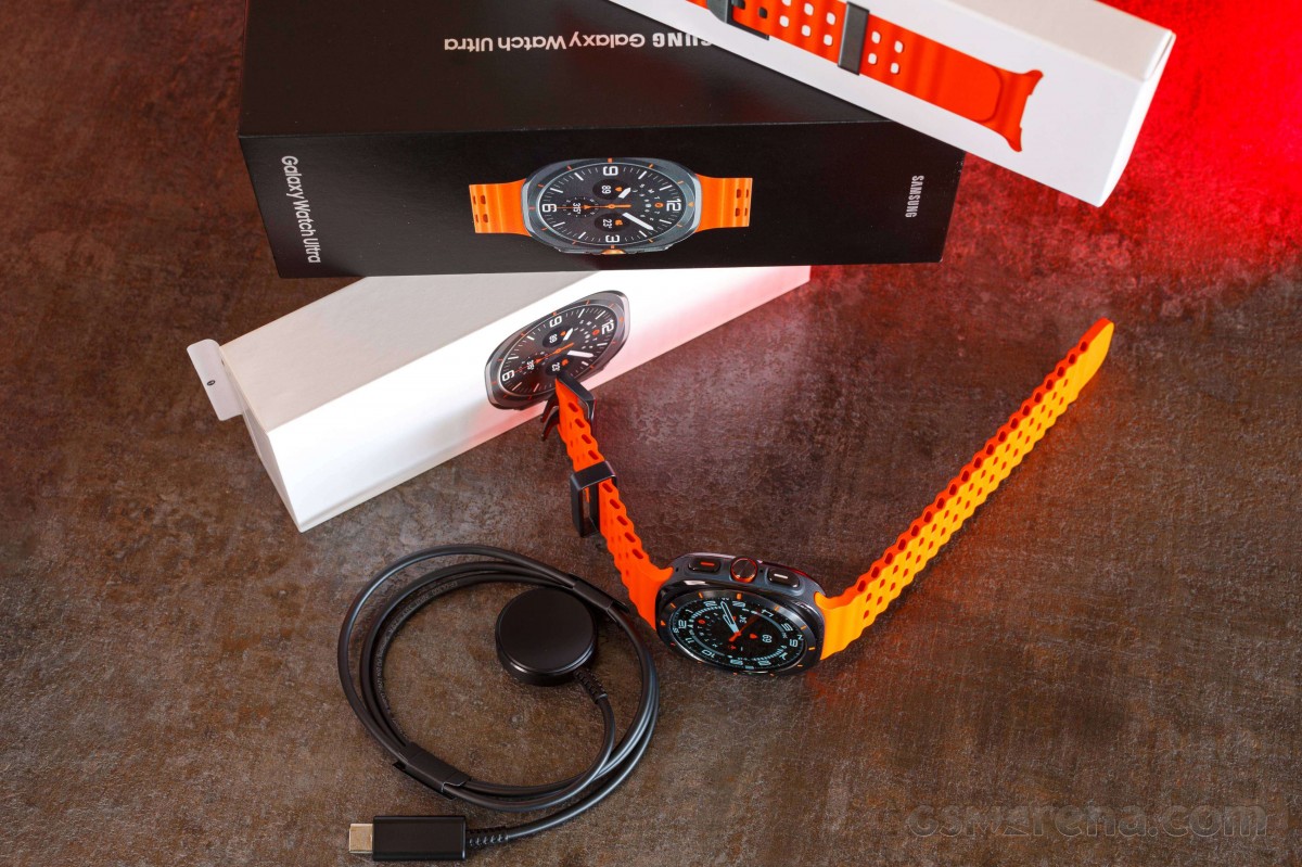
The big story with the Galaxy Watch Ultra is how much it looks like Apple’s own Watch Ultra 2, but if you look past the similar buttons and the orange accents and strap color, it’s a very different device.
For starters, it has a square case with a circular bezel and screen inside, whereas the Apple Watch Ultra is more of a rectangle, display and all.
The Galaxy Watch Ultra doesn’t have a physical rotating bezel, which is a huge point of contention with Galaxy Watch fans, but it has a software rotating bezel when you move your finger on the edge.
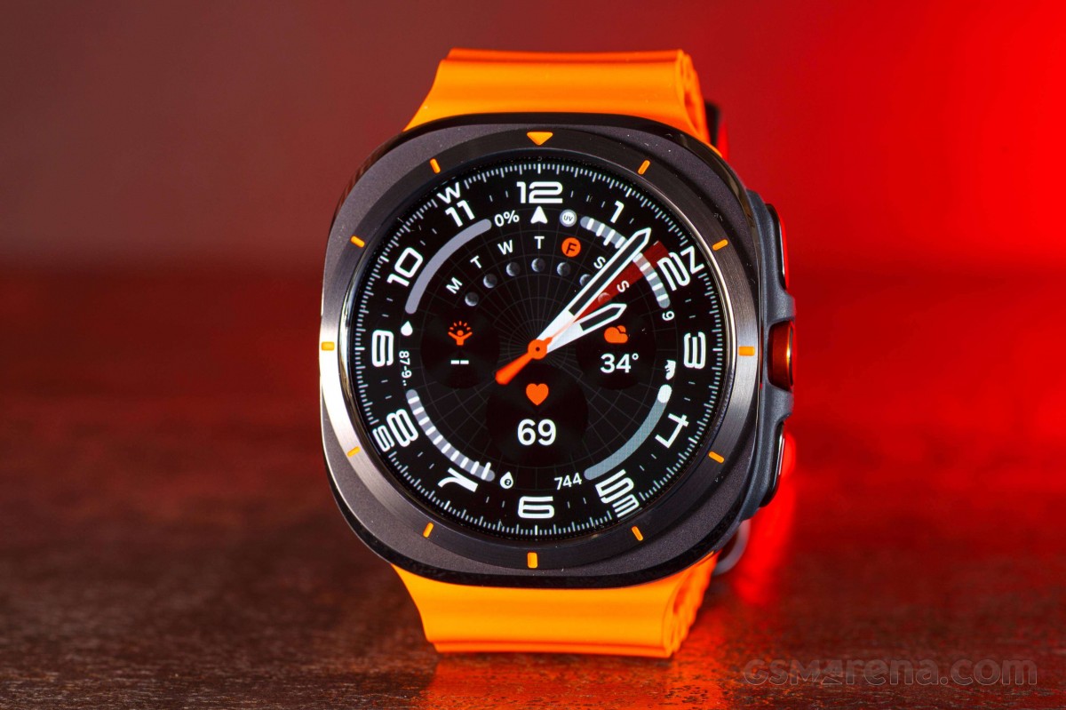
There are three buttons on the side of the Galaxy Watch Ultra. The middle button is the new “Quick button” and by default, it opens up the workouts menu. You naturally go to this button as a home button and it feels unnatural at first. You also kind of expect it to rotate, which it doesn’t.
A note on the vibration strength of the Galaxy Watch Ultra – it’s immense!
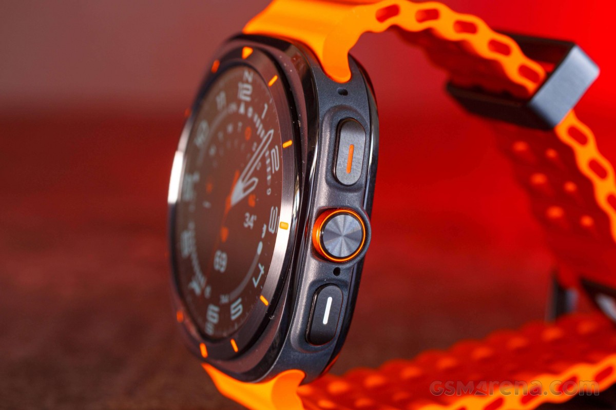
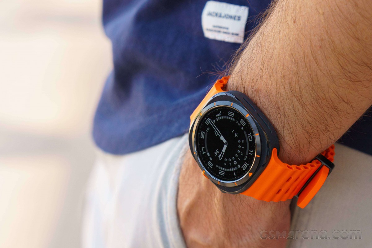
This is a big timepiece – once you take it out of the box, where it starts off without the strap – it feels big and heavy for a smartwatch. But once worn it sits balanced on a regular wrist and doesn’t feel as big as it looked.
The Galaxy Watch Ultra has a new Exynos W1000 SoC that makes an immediate impression. Everything is snappy and smooth on this watch – noticeably more so than on the Galaxy Watch6 series.
Those are just some of our early impressions. We’ll take our time testing this one! Stay tuned!
